Friday, April 23, 2010

Digital Imaging - 'First Week'

'First Week'

My digital collage still maintains the same theme and message of chaos expressed through my manual collage. The digital collage now shows these ideas through a more logical process, similar to how a human brain would organise all the new experiences.

The image can be simply broken down to the character in the foregrounds thoughts of the week being downloaded to a computer, which is located in a massive computer hub with screens on the wall showing images of the week. These images and data are being organised into dates and graphs assembling the information into a logical form. 

I tried to keep the feeling of a three dimension work in a two dimensional form by creating depth through the use of a foreground mid ground and background. I decided that the colour red was a fundamental part of my image as it represented stress and gave a feeling of chaos.

I created a character, which represented my self as I wanted to incorporate how a human brain and a computer system sort of operate the same way in storing memorial in a logical form.

The main reason I choose to reflect on my week at university this way was because I wanted to create an image that was personal to show what it was like to adjust to a new experience. I found that my first week was a bit chaotic and I wanted to relate how the human brain can operate in a similar way to a computer system. I wanted to replicate how my image matched my thoughts.

I haven’t taken anything away from my manual collage as such in my digital version. I have just managed to compose the image to make it more aesthetically pleasing. All the core ideas were retained in the digital image, with the links between the neurological system and thoughts, feelings and memories. But were …….

There were several trial and errors before I managed to produce an image that I was happy with. It started with taking a photo of the manual collage and importing it into photoshop and de-cluttering the image and keeping the main visual elements like the keyboard keys and Utas symbol. I made attempts to create electrical wires in photoshop using opacities and glow effects but my main concern was that I wasn’t representing my week in quite the way I envisaged.  

This sparked two more attempts to create two more images with a typography approach which I first used in the manual collage. This however I did not find the most exciting visually stimulating piece of work.  It was creating with the intent that my thoughts and feelings were all linked together through the neuro networks of the brain and almost had a feeling that these thoughts could just escalate forever.

Challenges – the main challenges I faced was trying to create a sense of perspective without the viewer realising that infact there eye was following the picture from right to left. I wanted the viewer to try deceiver the information that my brain had to take in that week, rather than the viewer just seeing it as a flat image. 

Digital Imaging - Slave for Addiction


Intent: The intent of this project was to create a narrative using three or more images to illustrate how the coffee trade can be related to the illicit drug trade. I also wanted to try educate consumers that when they purchase a cheaper product in supermarkets to try and think where this product has come from because their is usually a reason why it is cheaper than others on the shelf.

Producing the final images- Five of the eight photographs were all my images that have staged with props and manipulated in photoshop. The images that i have uses from sourced sites and manipulated were 'Dealers', 'Silenced' and 'Slave Fields'.

Artist Statement-

Materials: Installation, Photography and Print

'Slave for Addiction' uses eight separate images to illustrate the parody between the coffee trade and the illicit drug trade. Together these images convey how mass marketing and consumption of cheap consumer products such as coffee may have a positive effect on consumers. Although this also has a horrific impact on the slave workers who are forced to work for these companies to produce a cheap alternative.
The set of images can be either viewed from left to right horizontally, though the narrative can be viewed starting from any image in the set. This is because each of the sections of the set inter weave and relate to each other through various points. An example of this is the slaves make the products, the consumers purchase them and them become dependant and addicted, this then becomes a never-ending cycle.


'The Lab'

This image is a take off of a backyard Meth lab in someones bathroom. 'The Lab' shows as consumers we don't know the actual origin of these products, what ingredients are put in them and if the label is displaying the correct information.


'Labyrinth'

(Same principal as the Lab from a different angle)


'Dependency'

'Dependency' illustrates societies absorption of mass marketing and product branding, it also discusses our dependency of repetition of daily activities such as drinking coffee every morning.


'Addiction'

'Addiction' discusses how some people have become heavily reliant on their daily fix of coffee just to even start there daily routine. This I believe starts from the marketing of caffeinated related products such as coffee to give us our quick fix of energy when we feel deflated. This is similar to the need drug addicts have to get there next hit, which is symbolised in the image by the girl shooting coffee directly into her veins.


'Cartel'

The image 'Cartel' illustrates the mass production and consumption of coffee through major supermarket chains and global enterprises across the world. As consumers we are able to buy coffee at cheaper prices then ever before. However amongst all the glamour and sleek advertising the background information of where these products have actually come from are forgotten. The companies who produce these products at low prices forget to mention the slaves who work in horrific conditions in third world countries to deliver us cheaper competitive prices. These supermarket giants in a way are like the local cartel like the illicit drug trade.

'Dealers'

'Dealers' is an altered image of a coffee chain giant Starbucks, referred here as Starfucks Coffee. This image relates to coffee shops as the dealers of coffee beans just like the dealers of the drug world. Coffee shops rely on consumers becoming addicted and dependant on there products so they purchase them on a daily basis.

'Silenced'

'Silenced' shows a young boy, like him many other children are forced to work in horrific conditions, just like the slave workers harvesting opium and cocaine. In this image he has his lips sewn together representing that he has no choice or no say over his entire life. This boy is forced to grow up into a world where consumers expect competitive prices and this is how supermarket giants achieve these figures.

'Slave Fields'

'Slave Fields' depicts a scene from everyday life which slave workers have to undergo just to stay alive. These people are forced to work at gun point just to produce coffee at competitive prices for retailer giants.

Other concepts and Ideas

My first concept for my narrative task was to create five images showing the effects of climate change over a 500 year period in tasmania. These two images were tests of possible layouts of the images, this idea was abandoned early as it became very time consuming the scale that i wanted these images to be.

Test Image Two
Test Image One

Monday, April 5, 2010

Core Studies: 'The Hidden Truth'

Development of Ideas and Rationale

‘The Hidden Truth’ is a stencil installation piece, which uses light to hide and reveal the truth; just the way the government can pull a sheet over the eyes of the public to hide the truth within the media. These three stencil works are part of a series of sections showing how the Howard government presented false information to the Australian public throughout their 10 years in government.

The false information that was told to the public is represented in black spray paint on the canvas and can only be seen when the lights are turned on in the room (Canvas Lights On). Once the lights are turned off the truth is then revealed to the public with text that glows in the dark, which is painted on using phosphorescent spray paint, commonly known as ‘glow in the dark’ paint. The phosphorescent spray paint represents that if you look hard enough or question information everything isn’t as transparent as politicians lead to believe (Canvas Lights Off).   

Phosphorescent paint works by charging up under UV light over a period of time and once charged can glow in the dark for hours. ‘The Hidden Truth’, was created on canvas and I used stencils to create the lettering with black matte spray paint and phosphorescent spray paint.

The other two canvases have images on them showing the picture that was released to the public and the images that were hidden from the public. These images were printed on the computer and then sprayed with phosphorescent paint so the truth was visible. There are three images per section in the installation piece and each section has a light turning on and off on a ten second timer. This allows the phosphorescent paint to maintain charged and the truth is constantly revealed. As well as the lighting timer each section will also have audio from newscasts of politicians relating to each section these will be played on a loop.


Canvas Lights On: When the lights are turned you can only see the lies of the government.


Canvas Lights Off: When the lights are turned off the canvas discards the lies and deceit and the truth is revealed in a hidden message in phosphorescent paint.


Lies & Deceit:
This canvas shows the image that was released to the media by the government in the children overboard scandal in 2001. This photograph was doctored by government officials to make it seem as if children were thrown overboard from the SIEV 4 when in fact this was not the case.  This image was made by printing a copy of the black and white photo onto the canvas then I stenciled letters onto it as well using black matte spray paint.  


The Truth: This canvas reveals two photos of what actually happened, these photos were taken by a navy officer and show that the SIEV 4 was in fact sinking and that’s why people were jumping into the water. This image was made the same way but I sprayed the photos with phosphorescent paint to make them glow in the dark as well as the letters.

Background Information

Section One – Children Overboard 2001

Section one consists of three paintings relating to the children overboard issue in 2001 where the government released two close up photographs to the media saying that asylum seekers were threatening the Australian Navy, by throwing children off their boat into the sea because they were not allowed into Australian waters. This in fact was not the case, a women was actually holding up her child in hope that the Navy would cease fire their warning shots as their were children onboard the ship. Their ship was then turned around and sent out of Australian waters. Their boat then began to sink and under international maritime law the Navy had to rescue the Asylum Seekers. The photographs released to the media by the government did not show or mention anything about their sinking boat as the photos were cropped to tell a different story to the public.

The picture in black and white was the cropped photograph that was released to the public in 2001. The other two photographs in phosphorescent ink on canvas three were a series of images taken by a naval officer at the time of the incident and these images were never released to the public at the time.

The real information was not supplied to the public at the time of the incident as it was during Prime Minister Howard’s 2001 election Campaign. This was because Asylum seekers and border security was one of his main election priorities.

In Senator Faulkner’s speech in the Maritime Inquiry Investigation of the children overboard scandal he said "The response to boat people or asylum seekers was the main focus of the Howard Government in the lead up to the last federal election. The Government's strategy was based on politicising the asylum seeker issue for electoral advantage. It wasn't just the Tampa episode, or the bald faced lies about children being thrown overboard, it was a systematic campaign to engender public fear about asylum seekers and the need to protect our borders against them at all costs."


Other Sections in Exhibition

Section One- Children Overboard Part I

In 2001 the government released two close-up photos of children in the sea

The photos were actually doctored to hide the sinking ship in the background from the public.

It was said that these photos were taken after children were thrown overboard from the SIEV 4


Section Two- Children Overboard Part II

Defence Minister, Peter Reith told the media there was a video of the incident.

            But the video does not indicate that children were thrown into the water

            His response “Well, we’d better not see the video”.


Other Sections will touch on issues such as:

Section Three- Introduction of GST Part I

Section Four- Introduction of GST Part II

Section Five- Work place reform Part I

Section Six- Workplace Reform Part II

Section Seven- Terrorism Part I

Section Eight- Terrorism Part II


Conceptual Sketches


  Image Above: Conceptual image of how the exhibition may potentially be arranged.


Video: This is a simulation of how the audience will view the exhibition along with audio from newscasts. 


Image Above:  This is how the canvas was planned to be laid out will be laid out. The black text symbolizes the lies which the government has told the public, and the squiggly lines symbolize the truth, which is hidden between the lies.


Evaluation

After completing section one of ‘The Hidden Truth’ the initial feedback was that the work formally explored a unique approach by using light to hide and reveal the truth. The Hidden Truth has many successful elements in the piece and conveys a strong message that is easily interpreted by everyone. Formally I found it was very successful the text was clear with the lights on and once they were turned off everyone could clearly see the ‘Truth’ in the hidden message.  

Another successful element of ‘The Hidden Truth’, was that people were shocked that were actually misled and they wanted to find out what actually happened. This reiterated that an exhibition of these works would be really effective in captivating an audience’s attention. I found that there were no real weaknesses in “The Hidden Truth’ if I was to continue onto other canvases I might however change the background colour to conceal the phosphorescent text a bit more. Overall I found this project very effective in portraying my message to the audience with light as my medium to hide and reveal the truth.  


Monday, March 29, 2010

E-Media: Ident - The Creative Inside Me

Synopsis


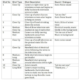
The creative inside me is a ten second short film about myself trying to express my creative side. This ident is symbolized through a character trapped inside three television sets. As well as representing my creative side, the set represents my past work for a production company and my current E-Media Degree. The film will be shot in two parts, Part One the character will be filmed and edited onto three separate DVD’s. Part two involves shooting the content on the television screens with the use of a dolly shot as the master shot and cutaways.


The film has a dark grunge style with dramatic lighting, the only lights used in the shot are the television screens. The colour of the shots will be de-saturated in post and and a green tinge will be applied in color and a darker contrast will be applied in Final Cut Pro.


The pace of the edit is very important to the film, close ups will be cut into a master dolly shot and a voice over and sound effects will be edited in Soundtrack Pro.


Overall Look of Ident:


What i want to capture-


I want my Ident to capture my creative side trying to get out. This will be symbolized by having someone trying to escape out of three television sets.
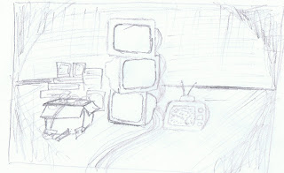


Look of Production


Lighting - I want the room to be completely black with the use of the televisions to light the room. I will use two red heads while filming part one, one will be a backlight and the other a fill light.


Colour- The colours i want to mainly focus on are a light to dark green tinge and a heavy contrast of shadows. These colour effects i think can mainly applied to the shots in post production.


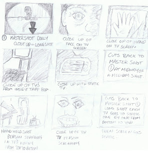
Edit- The production will be edited to a fast pace with the main shot being a tracking dolly shot away from the television sets to represent space. The other shots will be close ups of the television sets cut around the dolly shot.


Music  /  V/O  / Sound Effects- 


V/O -  The voice over is from the actor playing my creative side.


Sound Effects- Television Static, Electricity, Crackling, Echoing voices, screaming


Music- Dark grunge feel


How I Plan to shoot this:


The production will have to be shot and edited in two sections.


Section One-     I will have to shoot all the shots for the television screens first and then edit each screen into a different ten second loop. 


Section Two-     I will then shoot all the dolly shot involving the television screens with all DVD’s playing on a loop on separate DVD Players.


Concerns-  Inter lacing, will this work by de-interlacing all the shots in final cut pro first or will it not work at all. My interlacing concern was solved very easily, to avoid this i shot the shots for the television screens in a 4:3 aspect ratio so i did not have to worry about letter boxing or squeezing the image.  


Edits- I am going to do two edits of the final version one edit will be of just the camera on a tracking shot backwards. The other edit will have the tracking shot as the main shot and close up shots cut around the tracking shot.


Ideas on camera equipment- I think it might be best to shoot the content for the television screens in 4:3 so i don't have to worrying about cropping the image as they will need to be exported as standard definition anyway.


Section One: Pre-Production

Possible shots for television screens


-Stand subject away from black wall

-give them a hair light and fill light, maybe introduce a key light from the side to give them a shadow across their face.

-introduce warm light i would like to see a warm white balance.


Shots to maybe incorporate


- close up of face

-close up of mouth

-close up of eye

-close up of hands smearing across screen

-close up of hand knocking

-close up of head eye level

-close up of body eye level

-close up of legs eye level


Script Ideas


Possible script lines for voice over


- Let me Out!


- I want to be creative get me out of here help!


- Someone Let me out!


- Ok im ready to get out now


- Come on you can let me out


- I just want to be creative


- What are you waiting for?


- Thank you


I think it will be great to play around with these lines of dialogue in the studio as well as it might be a bit more natural for the actor.


            Shot List for First Shoot for three DVD's
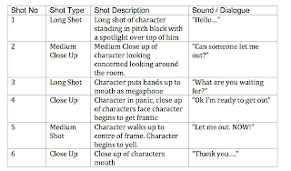

    Storyboard for first shoot for three television screens
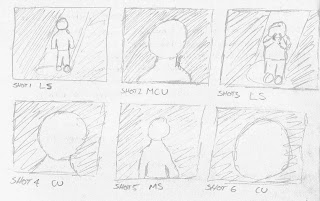


The shots above are the main basis of the character scene. I also want to add into the scene some close ups of the eye darting back and forth and the characters lips saying each word. I also want to get some shots of the character directly front on from eye level so i can construct the characters head, body and legs on the television screens in part two.


These are finished edits of the three separate DVD's that were used on the television screens for the section two of filming.


Television One


Television Two


Television Three


Section Two: Pre-Production

Shot list for Section Two

Edit One Just Dolly Shot
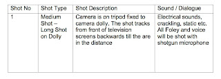
Shot list two for Section Two

Edit Two Dolly shot with quick cutaways
Storyboard

Section Two
Finished Version


Reflection


In reflection of my ident project i believe i achieved what i originally set out to create. I managed to capture the feeling and look i originally planned. The hardest thing i found was trying to play all three DVD’s all at the same time. I worked out that they were not all looping at the same time as the lasers were different speeds. Even though this was a challenge the three television sets worked in creating a character that actually looked like they were trapped inside the television set. If i was to do this task again i would make sure i was to use three of the same DVD Players to make the synchronizing of the images a lot easier. Overall I believe the concept worked and I managed to get the message across within the ten second time restriction.